|
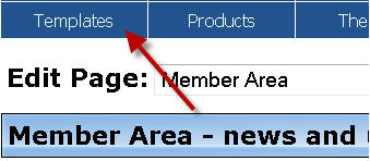
Templates
 Whatever membership script you're using, you're going to need to spend
some time during the design phase customising your member page templates.
You need instructions, explanations, user guides and, if you're smart,
some kind of welcome video to settle your members in. Whatever membership script you're using, you're going to need to spend
some time during the design phase customising your member page templates.
You need instructions, explanations, user guides and, if you're smart,
some kind of welcome video to settle your members in.
This is probably the least exciting phase of designing a membership site
but you've got to bite the bullet and spend some serious time on this.
Don't think this is something on which you can just spend five minutes at
the end and be done with it. The quality of your templates will, for many
people, determine how long they stay and whether or not they provide you
with any profit.
Exactly what information you need to include will depend on what your site
is about, but there are some items that will apply for virtually every
kind of membership site.
Member Homepage
The first page your member sees when they log in is the most
important. The last thing you want is to have members clicking around
aimlessly, unsure of what they're looking at or where to go next. Some
people will be happy to click around and explore for themselves but a
significant portion will need handholding. They'll need you to tell them
where to go and what to do when they get there. The best way to accomplish
this is with a step-by-step list.
Few would admit it, but most people like following instructions. It makes
them feel safe and secure. If you're following a set of instructions
properly, then you know you can't be going wrong. Instructions presented
as a series of steps are even more attractive. Give someone a list that
starts with 'Step One' and they will instantly know that this is an
instruction to take action and that, once this step is finished, they
should look for a 'Step Two'. The truth is, from a very early age, we're
hardwired to recognise and follow lists, whether it's an assignment at
school, a tax return or the instructions on a Pot Noodle.
Figure out ALL the things you would like your members to do when they log
in for the first time and then make this into a list, ordered by YOUR
preference. Downloading and using your product should be last on the list.
If you make the mistake of putting this as the first step, they'll be
distracted and may never go back to the list. Realistically, not everyone
will complete every step, some will cherry-pick, and some will skip right
to the last step. That's ok. Enough people will follow all or some of the
steps to make this exercise very worthwhile.
If you want to seriously increase the number of people that complete all
the steps, then offer an incentive to do so. This could be anything from
an exclusive report to a free upgrade. Depending on what your steps are
and how valuable it is to you that they're all carried out, it may be
worthwhile offering a significant bonus for carrying out every step.
As I mentioned at the beginning, a 'welcome' video (or even a simple audio
message) is a great idea and will help the member to feel valued. Keep it
short, however, otherwise people will switch off or ignore it altogether.
In fact, apart from thanking the member for registering, the main purpose
of an introductory video should be to direct your member to the list of
steps.
Complete Your Profile
If you've kept your initial registration form light, then there
will be lots of blank fields on the member's profile page. Make one of the
steps completing the profile page in its entirety. Some of the fields may
seem like overkill but they all have a very valuable use.
Address Fields: Believe it or not direct mail campaigns are still alive
and well but, at the very least, having the address of your members will
allow you to send them literature related to your affiliate program.
Another use for this is to send your members a 'thank you' card after
they've been a member for a certain length of time. This is a classy way
to increase customer retention and loyalty.
Telephone Number: If enough members provide you with their telephone
number then you can create a contact list that can be used to promote
high-end coaching programs or Internet Marketing seminars. You don't need
to create your own call-centre for this purpose as there are companies you
can partner with who will provide the product and marketing campaign and
give you a cut of the profits. Think of it as an advanced form of
affiliate program.
Another good reason to ask for a telephone number is when your product is
an expensive one. You then have the option to contact your customers
individually to ensure they're having a problem-free experience. Give your
customers more care and attention and you'll get a better retention rate
and fewer refund requests.
Confirm Account Delete
If, heaven forbid, a member should decide they want to delete their
account, the LFM script will show them a screen asking them to confirm
their request. As well as protecting members from accidental clicks, this
also gives you a final opportunity to convince the member to stay.
If a member is determined to leave then there's little you can do. The
goal here is to connect with the people who are leaving reluctantly. Maybe
you haven't quite provided what they're looking for, or maybe they feel
they've seen everything you have to offer. Say the right thing here and
you could keep them, if not indefinitely, at least for another 2-3 months.
How might you persuade them to stay? What can you say that
will influence them to give you a second chance? A free gift or a
complementary upgrade is the obvious choice but I suggest stretching your
imagination and aiming for something a little more unpredictable. How
about a special member upgrade that isn't available anywhere else? Be coy
about what's inside and hint, rather than describing it explicitly. Stoke
the fires of curiosity and you may convince your member to take your offer
simply to see what else you've got. Tell your member to send you a support
ticket quoting a suitable reference and, obviously, remaining a member for
a bit longer should be one of the conditions. If all else fails on the
confirm account delete page you could send them somewhere else through
your affiliate link.
Account Deleted
If you fail in your attempt to retain your member, this isn't the
time to be snooty. Thank the member for their custom and wish them well.
Separate on good terms and they may return in the future.
That's not to say you can't still take the opportunity to boost your
profits. The 'Account Deleted' page is the one place where you should feel
free to promote one or more of your competitors. You've already enjoyed
the person's custom so why not send them to a competitor and make some
affiliate
commission in the process? This is an especially sensible strategy if your
competitors offer a high-quality service. Your ex-member will, hopefully,
remember who referred them and will also appreciate your willingness to
unselfishly direct them to a quality website, despite it being one that
offers a competing service.
Login Page
Your 'Login' page is a prime piece of virtual real estate. I've
lost count of the number of membership websites I've visited whose login
page is just a chasm of empty space with a tiny login form in the middle.
This page is crying out for some action and it's so simple to integrate.
Add a simple message, above or below the login form, that says 'Before you
log in, have you seen..?' Then display a banner or button containing a
relevant promotional offer. As previously discussed, this is a good page
to offer to one of your preferred JV partners. If you don't yet have a
partner for this page then please, please don't shrug your shoulders and
leave it blank. Instead, feature an affiliate program for something
relevant. The ideal product placement is a software program that stores
passwords (such as RoboForm). This type of product is even more relevant
for the 'Forgot Your Password' page.
Signup Form Header
LFM has a specific template for the space above your registration
form. Surely I don't have to tell you that this is NOT the place to pitch
anything else! In fact, apart from your sales page, this is the one place
on your site where you must remove every possible distraction from the
primary goal - in this case completing the registration form.
If you place anything in this area, then it should be some kind of
encouragement to complete the page and hit 'Send'. Some simple
instructions may be appropriate, but avoid excessive volumes of text as
this can be intimidating and distracting.
A telephone helpline or a link to your support website can be a reassuring
presence. Most people won't need to use either, but simply letting the
user know that they are available reinforces the impression that you're a
legitimate and helpful business.
Along the same lines, trust seals are an excellent idea and some seal
providers will even guarantee an increase to your conversion rates if you
use their product. There are lots of trust seal companies out there, so
shop around. I won't recommend one company specifically but I would
encourage you to use a service that has been around for at least a couple
of years; this gives you the best chance of finding a dependable provider
that's here for the long-term.
Thank You Pages
When a customer completes their payment or verifies their email,
the common practice is to direct the user to the login page so they can
immediately access their content. My thinking is, what's the rush? There's
no harm in side-tracking the member for a few moments.
The 'Thank You' page is another good venue for your JV partners or for an
affiliate promotion. Keep your offer short and simple; you're asking your
member to hold off from logging in for a few moments but you don't want to
frustrate them. Present something in the form of an 'unadvertised bonus'
or an 'If you're interested in this, then you'll also like''
The one rule to remember with the 'Thank You' page is that your offer
should come last on the page, below confirmation that the payment has been
received and below a large, highly visible link to the login page. If your
offer is visually pleasing, you will still capture attention before the
person clicks away. But if you reverse this order, and place the offer
first, then you're going to get a lot of customer support tickets from the
easily confused. For the same reason, make sure your offer, when clicked,
opens in a new browser window or tab.
Upgrades Page
This page is designed to make it easy for your members to upgrade
to a higher membership level. Customise this page for each membership
level so that, if you have more than two levels, your members only see
options to upgrade to higher levels. In other words, you want 'Gold'
members to see the option to upgrade to 'Platinum', but information on the
'Silver' level would be redundant.
Especially if you have multiple upgrades to offer, the 'Upgrades' page is
not the place for a long sales pitch. Use bullet points and concentrate on
the core benefits of each upgrade level. Some kind of scarcity tactic is
valuable here, such as limiting the number of members that can upgrade or
indicating that the price will go up on such and such a date. A short
video describing each upgrade level is also a good way to fit necessary
information into a short space.
Downline Builder Header
You can use the Downline Builder header for promotional material,
but I prefer using it for some brief instructions. Keep it brief and
concentrate the user's mind on accuracy. Something like this:
Unless stated otherwise, joining these programs
is FREE. You are totally at liberty to choose which programs to join
(or not). Any that you do not join will default to your sponsor's
referral id.
You can change any of these codes at any time. Simply enter the new
referral id and click the "Update" button.
Always check each link. Never leave one that doesn't work (readers
don't like it)! |
Email Templates
We've already discussed the correct use of the email templates in
the 'System Settings' module. The only thing I'll add here is to encourage
you to make full use of the macros to customise the email messages. The
more of these you use, the more personalised the emails become and the
better they'll speak to the recipient.
If you handle all of these templates with care you'll finish up with a
better membership site and a more satisfied customer base. As I've
mentioned before, success and profitability with membership sites comes,
not from following one or two of the suggestions that you like the best,
but by applying as many of the Login Frequency Marketing tactics as
possible. Collectively these strategies add up to a powerful site that
will serve your business well.
|